We had a wonderful trip to Norway in late January, 2026. The big goal/hope was to see the Aurora Borealis. And we certainly did! But the entire trip was a truly enjoyable treat.
Itinerary
Tromsø: Jan 18 – 21.
Hurtigruten’s MS Trollfjord: Jan 22 – 29. On a ship, from Tromsø to the North Cape, then south to Oslo, stopping in ports (small towns) along the way for explorations.
Oslo: Jan 30 – Feb 3.
Tromsø: Jan 18 – 21
We booked our “cruise” on Hurtigruten‘s MS Trollfjord, departing from Tromsø on January 22nd. But we wanted a chance to see the auroras from “land,” prior to getting on the ship, from which we also hoped to see auroras — and did! So, four days in Tromsø prior to our departure, which worked out so well.
We booked two “aurora chasing” tours, the first one with Northbound on the 19th — their Northern Lights Adventure. Incredible! We left from Tromsø in a small van — with five other people — driving to where our guide felt the chance of aurora viewing would be the best. He was right! And we totally lucked out with the “show”! Just, wow! And a ton of credit to Northbound to getting us to such a great location and giving us great info on the auroras while we were there.
More aurora photos (and others from our trip) are posted on my photography website, here. Also, I set my camera up (on a tripod) to take 100 multiple back-to-back three-second exposures (which are good for auroras), and processed each sequence into time-lapse videos that are about ten seconds long. (So, they’re much faster than real time!) A few of them are here.
Our aurora photos were taken from the eastern shores of Balsfjorden, the fjord between Tromsø (in the upper center of the map) and the town of Nordkjosbotn at the end of the fjord to the southeast. (Balsfjorden is unlabeled on Google Maps.)
We had booked a second aurora “tour” for the 21st, but because we had such success on the 19th, we canceled. (It’s cold being out all night! And the second tour was with a larger group — 12 or so people. We were completely spoiled by our small-group tour with Northbound and felt no need to head out again.)
Our time in Tromsø was great! We enjoyed exploring the town and had some really nice seafood meals. (Including great sushi — twice! — at Suvi, casual seafood at Dragøy Coastal Mathus, and a refined and delicious meal at Mathallen Tromsø.)
Our hotel, Clarion Hotel The Edge (weird name!), was quiet, comfortable, and had a great buffet breakfast to get us going in the mornings. Here’s an iPhone shot from our room on our first morning in Tromsø, at 9:00 am. Magical light!
More magical light: an iPhone shot looking east across the harbor from Tromsø at 3:15 pm.
One of the main streets in Tromsø is pedestrian only. Here’s an iPhone image — taken at 3:20 in the afternoon on August 20, two days before the sun is first visible in Tromsø since the previous November (!).
Hurtigruten’s MS Trollfjord
We booked Hurtigruten’s North Cape Line – South, which travels from Tromsø north to Honningsvåg (and North Cape, the northern-most point of continental Europe), then south to Oslo. Seven full days total. Here’s the full itinerary And a map from that page, with red dots for our stops:
For all but one of the nine days, the ship traveled at night and spent the day docked at a port, giving us the opportunity to explore. For each of the in-port days, we signed up for an “excursion”; a guided tour — either a trip by bus or a walking tour of the town. The excursions were great! Also, we had some time to explore each of the towns on our own after we returned from our excursions and prior to reboarding the ship in the late afternoons — which we particularly enjoyed.
Day 1: Depart Tromsø.
Day 2: Honningsvåg and an excursion to Nordkapp (the North Cape).
A dramatic view at the North Cape. The “Globe Monument” is at the upper-right of the image.
Day 4: Narvik and a “Sámi cultural encounter” excursion. (The Sámi people are indigenous to northern parts of Norway, Sweden, Finland, and the Kola Peninsula in Russia.)
Day 5: No stop in a port; an all-day journey south. And a chance to see the beautiful Norwegian coastline during daylight hours.
Here are images from the ship, looking east to the Norwegian coast.
Day 6: Åndalsnes and an excursion on the “Golden Train.”
Day 7: Bergen and a guided “city walk.”
Day 8: Kristiansand and a guided “city walk.”
Day 9: Arrive in Oslo and disembark.
Oslo
Five nights in Oslo. A fun city to explore! (More details to come as I have time to write them up…)
Note (November 2022): this post was in my draft folder for years! It’s from 2015, and I “found” it while repairing broken links in my long-neglected blog. For me, at least, it was nice to read my old thoughts… So here it is!
On a Thursday a few weeks ago, the weather forecast was for cloudy the next day, which offered promise for some Friday morning photography at the nearby-to-home Potomac River. One special spot on the river — not too far from my home in Virginia — is Great Falls National Park, which offers great views of the spectacular falls.
But for this Friday morning, I headed off before dawn to Maryland — to the “Chesapeake & Ohio National Historical Park” (the National Park on the Maryland side of the Potomac). And, in particular, to the Billy Goat Trail, which skirts the river within the park. (A fun trail, too, up and down over the rocks.) The sights along the Billy Goat Trail are a bit more subtle, perhaps, than at the majestic falls upstream. But… they offer a great chance to look for compositions, more than views, which is what I wanted for that Friday morning.
I spent quite a while composing each of the the two images here. The above image was taken from some rocks that protruded out into the river a bit, which meant limited options for placing my tripod. The most obvious spots were to the left of where I (ultimately) ended up, but that meant that the rock in the right foreground was too far to the right, relative to the other elements in the frame. After quite a bit of climbing around on the rocks, I finally found the “final” spot, which meant that the rightmost leg of the tripod was in the water, and I was somewhat awkwardly perched on a pointy rock. It was the right spot for the photo, though. I find this process of being “in nature” and searching for a composition that seems to work well is a slow and intentional process. But it’s also wonderfully meditative, peaceful, and (usually) very satisfying. I (finally) ended up with a composition I was happy with, which, to me, at least, seems to unify a bunch of elements (including the shapes of the waves), in a way that didn’t come to me quickly.
The general process for composing the pothole photo below was similar, although for this one, I found “the best” vantage point by moving around with my camera — not attached to my tripod! — and exploring alternatives. Then it was easy to just put the tripod under the spot I found, and with just a bit of adjustment, to get the shot I wanted. Also, my first images were taken from a slightly higher vantage point, which meant that the sky above the trees reflected in the water just “above” the edge of the rocks to the left. Initially, I liked the resulting parallel lines (with the reflected and upside down edge of the tree tops paralleling the same shape as the rocks). But ultimately, I went for the composition shown here, which seemed simpler and with a nice contrast between the dark reflection of the trees and the lighter rocks.
Again, this was a relaxing and satisfying process.
I really look forward to coming back to this area frequently. One thing I’ve learned — and enjoyed — is that the river looks very different as the water level changes. Which it does a lot!
Edit (November, 2022): I found a more recent “version” of the above photo, taken in 2019 (vs. 2015). I wasn’t specifically trying to recreate the above image; it’s just a nice composition that I was drawn to, once again. I find it quite interesting to see how my approach and “vision” evolved — or at least changed — over those four years.
I’ve always been fascinated with architecture. And for me, photographing architecture is a great way to engage with it – and to enjoy and share it with others as well.
I’ve done some commercial photography previously for Maurice Walters Architect, which was a treat! His firm’s Arts Walk at Brookland Works in Washington D.C. won the AIA|DC’s 2014 Presidential Citation in Urban Design. My photograph of that project is featured on page 26 of the Winter 2014 issue of AIA|DC’s “Architecture DC” magazine. And here is his webpage for the project, which features two additional photos by me: the “Brookland” photo, and the Brookland Works entrance photo that follows it.
So I was pleased and excited when Maurice asked me to photograph the new brick “The Bartlett” apartment building in Arlington, Virginia. His firm did the exterior design work in 2011/2012, and now it’s up! Here is his webpage for the project, which currently features renderings, but which will soon feature some of my images as well.
It’s also a treat to use my two “tilt-shift” lenses, which make it possible to get images with parallel verticals (by getting the camera parallel to the ground, and then shifting the lens up or down to capture the composition I’m aiming for). I’ve had the Canon 24mm TS-E for some time. (It’s by far my sharpest lens – really amazing!) And just recently purchased the Canon 17mm TS-E – used, but in perfect condition – from Simos Xenakis (a wonderful and talented photographer, who is moving from digital to film). The “whole building” shots are with the 17mm lens. (Actually, several of the 17mm images are via several landscape-orientation images stitched together in Photoshop to make a vertical panorama.) A great lens to have for this work!
I’m very lucky to have access to a wonderful family vacation spot on McGregor Bay, Ontario, which I’ve visited on and off for many years — starting when I was nine years old. A long time ago! Elizabeth and I hadn’t been in several years, but were back this year, meeting up with my sister and her family for a special week-long vacation.
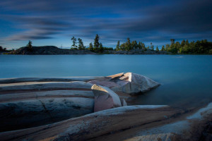
It was a treat! It was rather hot and cloudless for the first few days, but then it cooled of and we had some nice weather. It was such a treat to watch the light change through the day. (Particularly after around 8:00 pm, for an hour before the 9:00 pm sunsets.) And from day to day.
The above photo was taken at about 8 pm, as the colors really picked up, prior to sunset. (I actually desaturated this image a bit, as the colors were “too strong” out of the camera for my taste.) It’s 132-second “long exposure,” taken with my Lee “Big Stopper” 10-stop neutral density filter.
The beautiful smooth shapes were carved by glaciers 20,000 to 10,000 years ago or so. (Quite recent in geologic time.)
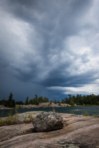
And speaking of weather, here’s a dramatic storm that moved through quite quickly. What a treat to really be able to “see” and photograph the (sometimes rapidly) changing weather! Unfortunately, I suppose, that requires spending at least a few days in the same place, which is a rare luxury.
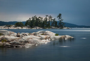
It was so cool to see the light for the shot below. Dark stormy clouds in the distance, but with the sun shining through from above, lighting up the rocks and glinting off the water. This was a 20-second exposure. A small detail, but I particularly liked seeing the swaying (and thus blurred) reeds in the foreground.
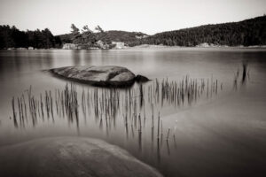
And here’s another image of some reeds among the rocks. (The one in the foreground submerged a bit.) Another 10-second exposure.
And here’s McGregor Bay (although not labeled). It’s a “little” bay to the north of Georgian Bay, which is a “big” bay to the northeast of Lake Huron.
So many beautiful spring flowers in our yard! Elizabeth is a wonderful gardener and nurturer of beauty! Previously I posted some images of flowers from our yard. Here are a few more.
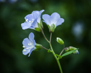
Above are the tiny blossoms of a Jacob’s ladder — so named because of the ladder-like pattern of its leaves, which you don’t see here. The little dusty-blue blossoms, sitting in their green “cups,” are just beautiful, I’d say!
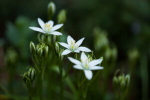
Below are some star of Bethlehem blossoms. Simple, but spectacular flowers.
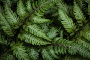
And finally, a view into one of our bunches of ferns. I love hunting for pleasing patterns within the chaos, and am happy with the pattern here. The search is a relaxing and rewarding “Zen” experience (and contemplating such beauty!).
Thank you for taking a look at our flowers (and ferns); I hope you enjoy them.
Seeing flowers in our yard in the spring is wonderful treat! Most don’t last long, which motivates me to enjoy — and photograph! — their ephemeral beauty.
Above are wild geraniums. Below is a may apple blossom.
And these tiny flowers are spring beauties (with blossoms only about 1/2 inch across) and mazus — with the purple, orchid-like blossoms.
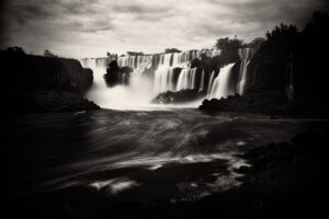
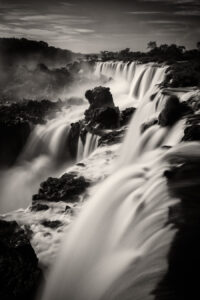
Iguazu Falls was just one of the many beautiful places we visited on our almost-three-week trip to South America. (A day-by-day account of our full trip is here, on my other website, visiblewind.com.)
A wonderful quote regarding Iguazu is from Eleanor Roosevelt, who reportedly exclaimed “Poor Niagra”! It is spectacular, indeed. And huge!
The above image is a 13-second long exposure, which I processed in black and white, particularly to highlight the falls as a (huge!) jewel within its rocky and tropical setting. It’s how I felt about it there, and I hope that feeling comes across in the image.
Below is a shorter exposure — only two seconds, and taken from a view right up against one of the (many) spectacular drops. Again, a sparkling jewel within its surroundings.
The top image was taken with my Lee Big Stopper, to that the 13-second exposure. The bottom with (if I recall correctly) a polarizing filter — although set to still allow some sparkle from the rocks below, which I like.
My wonderful photography workshop with Colin Homes this past March in Scotland left me with lots of beautiful images. And I believe there are still some “keepers” that I’ve yet to process. (I always process my images with Lightroom and often Photoshop as well. And for black and white images — like this one — I use the Photoshop plug-in Silver Efex Pro.)
The other day I was looking through my images and saw this one. It was from a gorgeous location — on the road to Applecross — but the colors seemed a bit off. I could have rather easily fixed them in Lightroom and Photoshop, but hadn’t felt motivated to. This time, though, with a fresh look at it, I decided a black and white version would be good. I’m very happy with the results! (In addition to the overall look, I especially like how the low clouds are obscuring the tall mountain peak to the left of the image.)
It’s a 45-second exposure at 16 mm, f/11, and ISO 100. Processed with Lightroom, Photoshop, and Silver Efex Pro.
I am now pleased to offer archival quality framed and signed prints, as in the image above. (The above image isn’t signed, but any that are purchased certainly will be.)
(And please note that prints of my photos have always been for sale via my website, by clicking on the “add to cart” link next to any image. If you don’t see that link, just click on the little “i” at the bottom of the image’s page, and it will show up. And if you’re in my blog, just click on any image, which takes you right to that image’s page and its “add to cart” link. More information about these prints is available from the “Print Options” link on the main stevesickels.com page.)
Printer, and Archival Inks
I maintain a color-managed workflow (which ensures that printed colors rendered as intended), and carefully print my images with archival inks on my Epson 3880 inkjet printer. As noted in this thoughtful review of the printer and regarding its Epson UltraChrome K3™ Ink Technology with Vivid Magenta:
“These are high density pigment inks that result in a wide color gamut that dry quickly. There’s also a new magenta ink that helps to create extreme purples and blues. These are true archival inks used by many fine art master printers, so you’ll find this ink used on top quality fine art prints Its widely accepted by collectors, galleries and museums around the world. I found the blacks to be fantastic! Despite my past disdain for matte ink, I fell in love with this formula from Epson for its deep richness. The colors produced by the K3 inks were always vivid and faithful to the original. Once I knew what I was doing, I could tell right away this was far better than any ink I had ever used before. It also seemed to produce colors that were superior to those achieved from places where I had previously outsourced my photo printing.”
Archival Papers
I’ve also selected Epson archival papers for printing — in particular, Epson Signature Worthy Hot Press Bright (as in the print above) or, Hot Press Natural. I find these “hot press” papers to be just perfect for my images. Hot press is a bit smoother than “cold press” papers, and captures fine image detail. Yet, as a matte paper, there’s no reflectivity (except from the glass, of course, as can be seen in the image above!). There’s also a warmth — for lack of a better term — that I find very appealing. As this review of Epson’s Hot Press Bright paper notes: “This is a gorgeous paper.” And finally, all the Epson Signature Worthy papers are of fully archival quality.
Here’s an Epson page with an overview of all the “Signature Worthy” papers, including Hot Press Bright and Hot Press Natural.
Frames and Archival Glazing and Backing
Prints are framed with this frame by pictureframes.com, and with “premium archival glazing, mat, and backing” (specifically, UV protective acrylic and acid-free mat and foamcore backing). If you’re interested in a different frame, please don’t hesitate to let me know.
Frame and Print Sizes
I offer prints and frames in multiple sizes, with some examples as follows (which reflect he aspect ratio of the majority of my images):
16″ x 20″ frame; 9 3/4″ x 14 1/4″ image
14″ x 18″ frame; 9″ x 13″ image
12″ x 16″ frame; 9″ x 13″ image
12″ x 16″ frame; 7 1/2″ x 11″ image (as shown in the image above)
11″ x 14″ frame; 7″ x 10 1/4″ image
Larger frames and prints are available as well. And I tend to prefer larger-sized mats (with smaller images) for a given frame size, but am happy to print larger-sized images than suggested above, too. (The Epson 3380 inkjet printer handles up to 17″ x 22″ prints — quite large!)
And by the way: these above-listed and “standard” size frames are significantly less expensive (from pictureframes.com) than other “custom” sizes, which is why I’ve chosen them. This cost savings is, of course, passed along to you.
More Information
Please don’t hesitate to let me know if you have any questions (via my Contact Page). I’d certainly be pleased to provide you with a custom made, beautiful framed and signed fine art print, carefully printed, and of full archival quality.
I was asked by Maurice Walters Architect to shoot some images of their very cool project, Arts Walk at Brookland Works and the Edgewwood Arts Building, in Washington, D.C. (And also — somewhat confusingly — referred to as Monroe Street Market.) It’s located here, and is a wonderful new arts-focused development project near the Brookland Metro Station. The image above is of the Edgewood Arts Building, which is just south of Arts Walk. A pdf’d description of the project is here (which includes several of my images).
In a credit to its thoughtful, innovative. and community-building design, Maurice Walters Architect won AIA|DC’s (the American Institute or Architects DC Chapter’s) 2014 Presidential Citation in Urban Design. (The full list of 2014 Chapter Design Awards is here — theirs included.) A big congratulations to the team!
And it was a particular treat to see one of my images featured prominently in AIA|DC’s magazine, ArchitectureDC (which is both in print and a nice online version, too). This issue features descriptions and photos of all this year’s winners. (Lots of great architecture!) One of my photos is the full-page image (the one on the left):
Below is the same image of mine that’s featured in ArchitectureDC.
It’s a 25-second exposure, taken this past July during a weekend market. My sense is that architectural photos are conventionally exposed for no more than a few seconds at most, to get a maybe a touch of blur from people’s movements. But during this weekend market, some people were still enough to register even during my longer exposure, which was exactly what I was hoping for. I’m pleased with how it turned out — and evidently so were the editors of ArchitectureDC!
Several more images…
A view of the 15-foot high “BROOKLAND” lettering on the back side of the Arts Walk building, which faces the Metro tracks.
And two more of the Edgewood Arts Building.
I’ve long been a fan of architecture (including childhood aspirations to a career in architecture ). So getting the opportunity to do this work was a real treat. I hope to do lots more architectural photography in the future!